Plotly.js Charts for Dashboards
Today we’re going to look at a really powerful charting library that is really easy to use and set up. Plotly Open Source Graphing Library supports several programming languages, including Python, Matlab, R, and most importantly Javascript!
I’ve had to build a few dashboards for IoT companies, and charts are definitely one of the biggest elements in the view. Need I say more about the significance of charts to business related reporting such as sales, network monitoring, stocks etc.
Plotly offers many kinds of charts and maps, but the most common ones I use are:
- Line charts
- Bar charts
- Step charts
Below I’ll walk through the basics on how I use plotly.js in an actual project.
Installation
Very similar to other charting libraries, you can get them via CDN or npm packages. More detailed guide is in their github page.
CDN
Insert the script in the head of index.html```prettyprint lang-html
```NPM
To install with npm simply do
$ npm install plotly.js-dist
Note that it is plotly.js-dist and not plotly.js
Import
Now to import it into your project do
import Plotly from 'plotly.js-dist'

...

Plotly.newPlot('div-id', data, layout, options);
In the html you’ll need a div with the id you want to point to.
<div id="div-id"></div>
Really easy stuff!
Plotting a basic chart
Now let do a basic line chart.
The javascript for this small chart is simple, we want to break down some of the important flags you need.
var trace1 = {
  name: 'Energy consumption',
  x: ['1-3-2019', '2-3-2019', '3-3-2019', '4-3-2019', '5-3-2019', '6-3-2019', '7-3-2019'],
  y: [10, 15, 13, 17, 19, 10, 11, 13],
  type: 'line',
  line: {
    color: '#45B5C6'
  }
};

var trace2 = {
  name: 'Cold water consumption',
  x: ['1-3-2019', '2-3-2019', '3-3-2019', '4-3-2019', '5-3-2019', '6-3-2019', '7-3-2019'],
  y: [16, 5, 11, 9, 0, 4, 0],
  type: 'line'
};

var data = [trace1, trace2];

layout = {
    showlegend: false
}

Plotly.newPlot('myDiv', data, layout, {
  responsive: true,
  displaylogo: false
});
trace
Each series in the chart is referred to as a trace. The xaxis is usually the time range, and the yaxis is the value. Here, I purposely use string for my xaxis because I want to be able to parse it into different localized format, e.g. Feb 2, 2019 in US, vs 2.2.2019 in Finland. Or even into quarters e.g. Q1/2018.
@note: Plotly has locale config, but I wanted more control.
If you treat each xaxis item as a category, then everything will work fine. If xaxis is an array of Date items, Plotly will automatically parse it into a timeseries chart.
You can specify the line color of the each trace. If you leave it out, Plotly will provide a color based on the index. To change the color, add an entry
line: {
    color: '#fff'
}
Notice that data requires an Array of object. This is a little bit different from other charting libraries like Google Charts or Highcharts. layout Layout is the general settings for Plotly. Here we’re hiding the legends by adding this in the object.
showlegend: false
Legends allow you to show / hide each trace, which is pretty handy, but I’ve decided to turn it off. In my app, I have other buttons outside the chart for me to control showing and hiding of each data, so I don’t need the legends.
Other configurations that I usually use for layout are font, autosize, margin, to make the chart fit your container.
Full documentation here: https://plot.ly/javascript/reference/#layout
configuration
These configurations are extra options for other functions around the chart, such as:
- Allowing Scroll and Zoom
- Modebar show / hide
Useful ones for me are
{
    responsive: true,
    displaylogo: false
}
This should be pretty self explanatory - the configuration allows the chart to change width according to the window, and also remove Plotly’s logo from the modebar.
Full documentation here: https://plot.ly/javascript/configuration-options/
Multiple axes
We now explore how to use different chart types in the same plot.
var trace1 = {
  name: "Energy consumption",
  x: [
    "1.3.2019 00:00",
    "1.3.2019 03:00",
    "1.3.2019 06:00",
    "1.3.2019 09:00",
    "1.3.2019 12:00",
    "1.3.2019 15:00",
    "1.3.2019 18:00",
    "1.3.2019 21:00"
  ],
  y: [20, 50, 92, 82, 14, 20, 50, 62],
  text: ['20 kw/H', '50 kw/H', '92 kw/H', '82 kw/H', '14 kw/H', '20 kw/H', '50 kw/H', '62 kw/H'],
  hoverinfo: 'x+text+name',
  type: "bar",
  marker: {
    color: '#270657'
  }
};

var trace2 = {
  name: "Air pressure",
  x: [
    "1.3.2019 00:00",
    "1.3.2019 03:00",
    "1.3.2019 06:00",
    "1.3.2019 09:00",
    "1.3.2019 12:00",
    "1.3.2019 15:00",
    "1.3.2019 18:00",
    "1.3.2019 21:00"
  ],
  y: [81.32, 72.1, 121.41, 71.31, 40.98, 30.96, 51.2, 71.92],
  text: ['81.32 Pa', '72.1 Pa', '121.41 Pa', '71.31 Pa', '40.98 Pa', '30.96 Pa', '51.2 Pa', '71.92 Pa'],
  hoverinfo: 'x+text+name',
  type: "line",
};

var trace3 = {
  name: "Lights",
  x: [
    "1.3.2019 00:00",
    "1.3.2019 03:00",
    "1.3.2019 06:00",
    "1.3.2019 09:00",
    "1.3.2019 12:00",
    "1.3.2019 15:00",
    "1.3.2019 18:00",
    "1.3.2019 21:00"
  ],
  y: ["off", "on", "on", "on", "off", "off", "on", "on"],
  type: "line",
  line: {
    shape: "hv",
    color: '#45b5c6'
  },
  yaxis: "y2"
};

var data = [trace1, trace2, trace3];

layout = {
  showlegend: false,
  yaxis2: {
    type: "category",
    side: "right",
    overlaying: "y"
  }
};

Plotly.newPlot("myDiv", data, layout, {
  responsive: true,
  displaylogo: false
});
Chart types
Here we have 3 basic chart types - line, step, and bar charts. You can configure them for each trace
type: "line"

...

type: "bar"

...

// step chart
type: "line",
line: {
    shape: "hv",
},
also notice that by setting the second yaxis2, we’re able set a second yaxis on the right side of the chart for text based categories.
{
    ...
    text: ['81.32 Pa', '72.1 Pa', '121.41 Pa', '71.31 Pa', '40.98 Pa', '30.96 Pa', '51.2 Pa', '71.92 Pa'],
    hoverinfo: 'x+text+name',
    ...
}
Custom text can be used to insert unit to the values. hoverinfo allows you to customize what you want to show when the mouse is hovering over the value. If we use the text instead of y then we can have the unit shown.
Putting it together

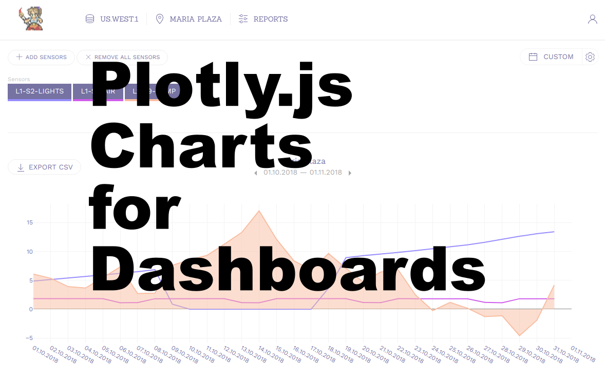
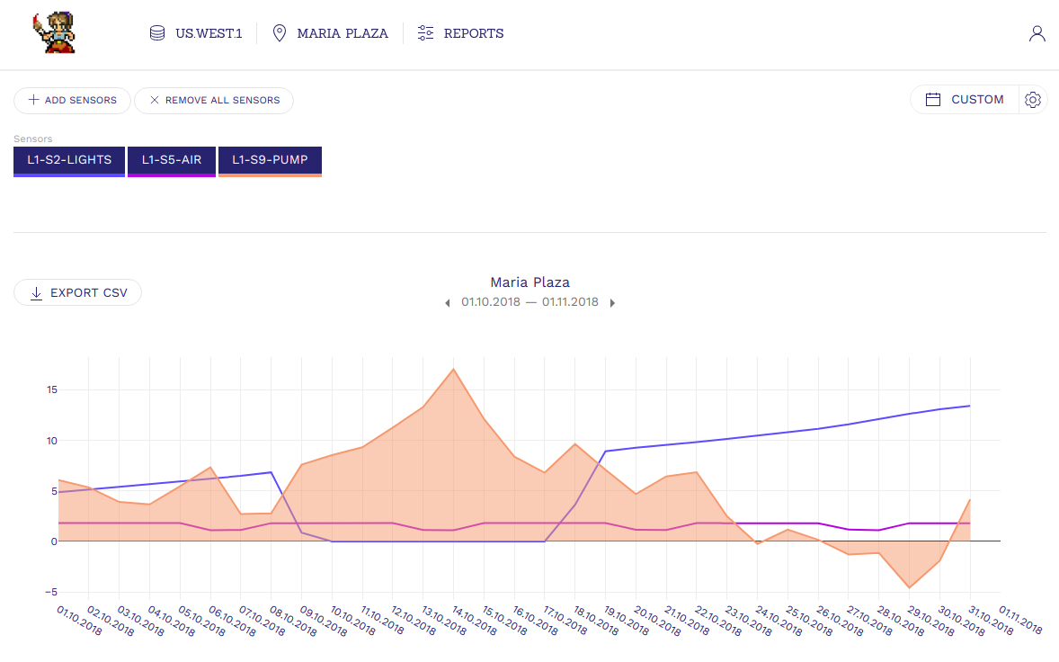
Here is a real life example of an iot dashboard for showing value changes of live sensor data. Hopefully with this you can use Plotly in your future projects with ease. View more examples of plotly here in the feed: https://plot.ly/feed/#/
Other charting libraries
- Highcharts
- D3.js
- Google Charts
- Chart.js
