UX (user experience) is the answer to the question of "why" and "how". Why should we have this feature? Why is the button red? How do I look at my settings? Why is it so slow?
Most of the time we associate UX to UI (user interface). But UI is only a small part of the larger picture. The user can also be a programmer, or a customer of a physical device. The main goal of UX design is to create a frictionless experience for the user[7].
The UX designer is usually an integral part of the agile development cycle between design and development, connecting good design, software development, and business goals into a wholesome and focused package. Software developers backend or frontend can benefit from UX knowledge.
Designers are the bridge between business and users, being this characteristic one of our strength. — Diego Mazo [2]
The folks at UX Collective asked the community what skills are needed as a UX designer. These are the 5 skills[1] they think are required to be an expert in UX design:
- Visual Design: Do you know the fundamentals design patterns and Gestalt principles?
- Business alignment skills: Can you communicate the business value of your design work and tie it into the overall goals of the company?
- Research: Can you collect actionable insights from customers and users through strategic (are you solving the right problems) & tactical research (are your designing the right solutions)?
- Organization & Communication: Are you able efficiently convey your message both in terms of information architecture and content?
- Technical: Can you code whatever you had visually designed? Make a simple prototype?
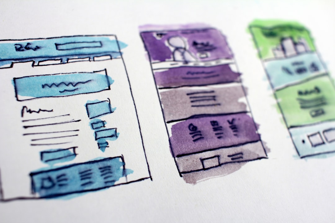
Today we're going to look at the visual part (or UI) of UX design. These are a few laws and principles that we as software developers can follow to increase usability of our app.
- Gestalt's Theory
User's tendency to visually categorize by scanning, not reading - Jakob's Law
User prefer websites that work the same way - Fitts's Law
Increase size of important action buttons - Hick's Law
Less option is better - Miller's Law
We can only effectively remember up to 7 elements at once - Endowed Progress Effect
Progress bar make users finish the task - Doherty's Threshold
Things need to happen <400ms to keep attention span - Hand gesture design
Mobile first design
Gestalt's Theory
Gestalt's Theory is a pyschological concept from 1890s that explores the way how people perceives information and using them to build good navigation, digestible copy, and effective color choice that has a great impact on the usability of the product[3].
Modern UX patterns uses principles of Gestalt's Theory one way or the other. By knowing the factors influencing visual perception, you can design the UI as to lower the level of misunderstandings users could perceive from the software. [3]
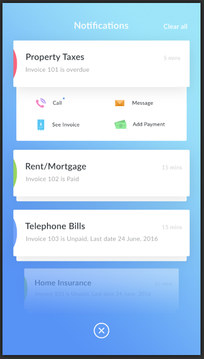
#1: Figure-ground Principle
The figure-ground principle states that if the visual field is homogeneous throughout, and there is a figure of a different color, there is a tendency to see the figure as positioned in front.
This is most apparent in the "card" system design whereby we insert important fields in white boxes to bring it to the front. Generally we do not want to go beyond 2-3 layers of foreground-background, or else it gets too "tall".
“White space is to be regarded as an active element, not a passive background.” — Jan Tschichold [8]
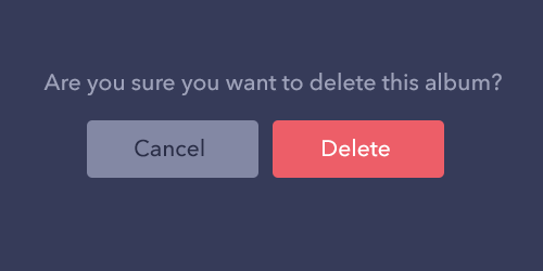
I would also say that having a separate color for call-to-action (CTA) buttons also brings it out to the foreground. It projects a more positive action. This effect is also called the The Von Restorff effect.
#2: Similarity Principle
The principle of similarity states that we tend to group things together when they look similar.
We can use that in chat boxes to separate who is talking. Using colors to separate ownership is an easy way to utilize this principle.
#3: Proximity Principle
The principle of proximity states that things that are close together appear as forming a group.

Whitespace between elements are very powerful. It's like a table with invisible lines, but much cleaner than using lines to separate elements in a grid format.
#4: Common Fate Principle
The principle of common fate states that when objects act or move the same way, we perceive them as being grouped together.
Using animation we can indicate a new page, or pop over menu. It's a good way to introduce new UI elements if you move them into the page together.
#5: Continuity Principle
The principle of continuity states that elements that are arranged on a line are perceived to be more related than elements that are not.

Aside from indicating groups, aligning elements in the page together helps give the sense of togetherness. As humans, we find symmetry and orderliness pleasing, even on a subconscious level.
#6: Closure Principle
The principle of closure states that we can fill in the missing information when elements in a composition are aligned in such a way that the viewer perceives that "the information could be connected."
Icons and badges are good examples where users generally can connect what the icon means, to a function that it might trigger.
#7: Simplicity principle
This principle implies that as individuals perceive the world, they eliminate complexity and unfamiliarity so they can observe a reality in its most simplistic form.[4][5]
I take this to mean general composition of the elements in the page. When users scan the page, they see large chunks of sections so that they can navigate with ease.
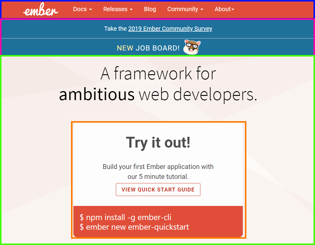
We can see here in Ember's landing page that there are clearly separated parts in the page. Each part has its own principle to tie it together, but on a larger scale, they also connect to each other.
#8 Past experience principle
This principle implies that elements tend to be grouped together if they were often together in the past.
Using green to indicate positive, and red to indicate negative, is one way to immediately project association to the action.
This can also be explained with Germane Cognitive Load: whereby it’s easier for the users to recognize and learn something new if they can discern it into a pattern from something they already understand. [6]
From the chevron arrows, we recognize that it seems to be a box that can be toggled to expand. We can reuse patterns like these so that users immediately know how to use the app. This is very similar to the next point - Jakob's Law.
Jakob's Law
Jakob's Law is coined by Jakob Nielson. It states that users prefer your site to work the same way as all the other sites they already know. [11]
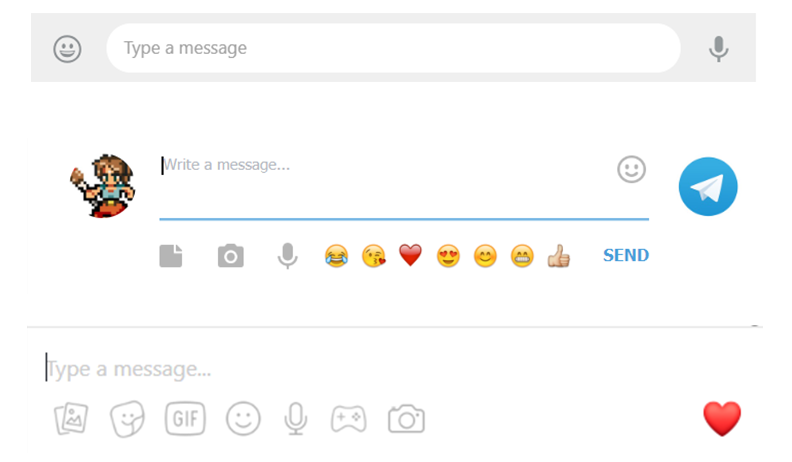
We are all familiar with chat apps. And users expect that their chat app will be a box in the bottom, with a text box, and some option for inserting emojis. It can be in a totally different language, and still users know where to find it.
Fitts's Law
Fitts's law is the amount of time required for a person to move a pointer to the desired button (e.g. CTA) decreases with larger size and shorter distance[9].
In other words, the action button should be made larger, and the distance between a user’s task/attention area and the task-related button should be kept as short as possible.
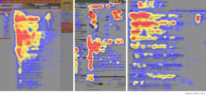
Research has established that the user scans the website in an "F" pattern, starting from the top left, and forms an opinion about the website within 50 ms[10].
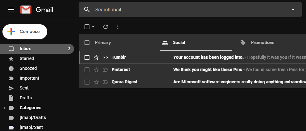
Google made this work by placing the most prominent feature of Gmail on the top left in a big white button. And to the right is the email list. Immediately the user finds the most important feature gmail has to offer. Also, many of the filtering buttons are close to each other.
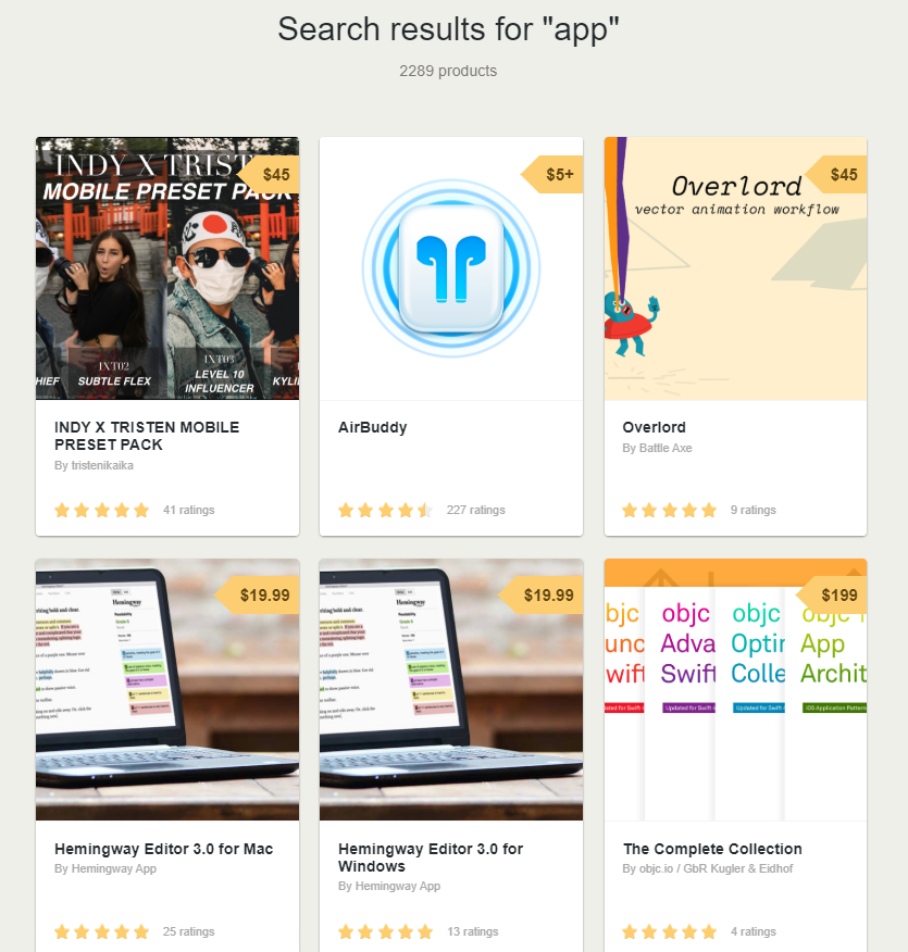
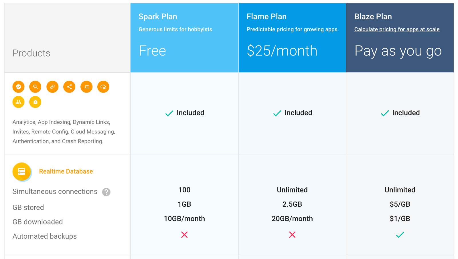
Hick's Law
Hick's Law is the time it takes for a person to make a decision decreases as a result of the lesser possible choices they have.

We can see how Amazon greatly improved their UI by grouping their services by smaller groups, thus having less options to choose per page.
Another business related use of this concept is in pricing. When given too many pricing option, users are left confused and unable to make a decision. Having lesser options increases the time to make a decision.
Miller's Law
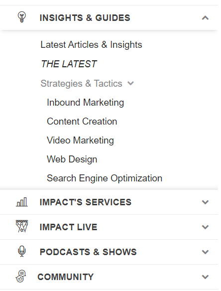
Miller's Law states that people can remember up to 7 different elements in their working memory, anything more will increase the percentage of errors.
We can reduce the amount of item on the page to roughly 7. If it's too little, try breaking it up into smaller chunks of 7 or less. Subheadings, layers, borders, are some of the way to section your information.
It's also a good idea to limit authentication code to less than 7 characters.

I imagine it would be quite annoying if you had to fill in 20 character authentication code in 3 seconds.
Endowed Progress Effect
Researcher Joseph C. Nunes documents the effect whereby people provided with artificial advancement toward a goal exhibit greater persistence toward reaching the goal. [13]
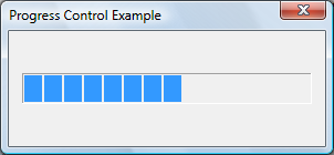
I'm sure everybody knows about the progress bar. But did you know many apps had to insert a fake progress bar, so that users feel better? [14]
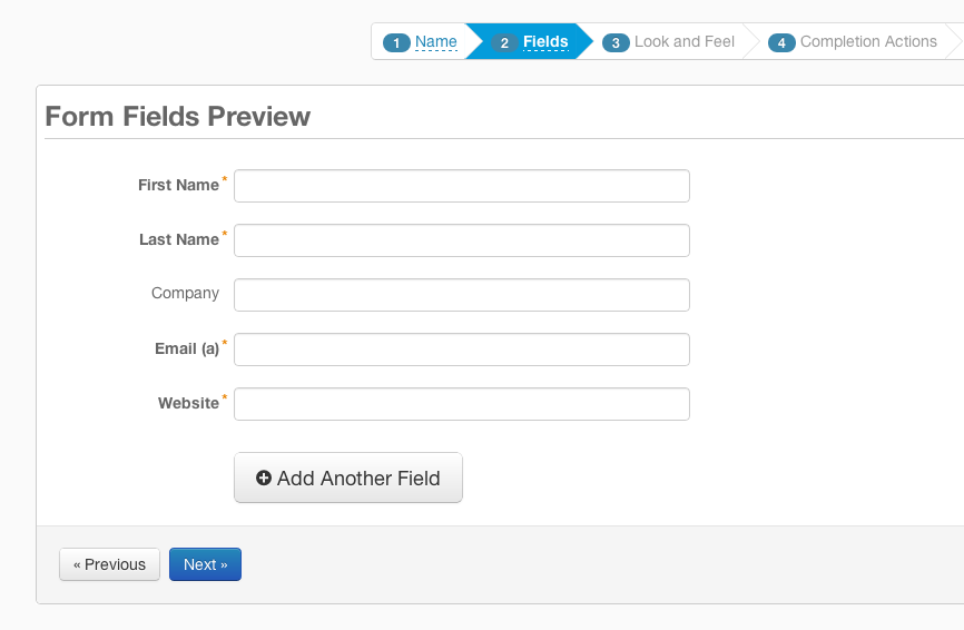
Actual progress bars are probably harder to replicate in an async function, but there is a place where progress bars can help a lot — wizards.
Wizards break up the mundane process of data entry, it also gives users a sense of progress so that it feels like they're moving forward.
Doherty's Threshold
In the age of fast internet, the worst sin is to have a slow app. Walter J. Doherty published a research paper in 1982 that set the requirement for computer response time is <400ms. [15] Any slower than that, the system is considered slow.
Aside from the obvious optimization of the system, we can also employ a few tactics to slow the user down.
We explored progress bars previously, it can help immensely to provide an immediate feedback.
Another way is to run processes in the background. For example deleting an email might remove the item from the screen immediately, but the actual DELETE call can be run in the background so that users perceive it as fast.
Hand Gesture Design
There are nearly 5 billion phone users in 2019 [16], that's nearly 70% of the world use mobile phones. All the newest web apps have responsive design to fit the mobile screen. But are we designing it with mobile in mind?
Here are a few ways to make it easier for phone users:
- Assume users will use their thumbs, not a stylus
- Have important buttons at the bottom of the screen
- Allow swiping to do actions
- Large buttons for fat fingers
- Optimize for right hands (sorry left-handers, you're only 10% of the population)
- Allow toggle-show password, typos are very common on phones
- Make sure input field is visible when keyboard is up.

Honorable Mentions
- Tesler's Law - for any system there is a certain amount of complexity which cannot be reduced. [12]
- Zeigarnik Effect - people tend to remember about an objective that was once pursued and left incomplete. [17]
How can I apply this to software development?
With all these information about user behavior, it only works if we implement and use it in our development. How can we do so?
- Be consistent with your use of color in buttons
- Reserve strong colors for important elements, everything else can be muted
- Split your information into a hierarchy of smaller things
- Give immediate visual feedback
- Have max of 7 items for every section
- Position important items on the top left for desktop, and bottom right for mobile
- Follow other website's behavior liberally
- Keep everything aligned
- Use the software you develop
What about software for developers? Developers are users too. They react in similar ways.
- Use consistent APIs
- Expose high level functions, not every low level function in the file
- Split your library into smaller modules
- Give instant and human readable error messages
- Include documentation on the top of the library file
- Follow similar behavior as other popular libraries
- Use the library you develop
Now, break all the rules that you've just learned because design is never set in stone. Happy UX Designing!
References
[1] https://uxdesign.cc/what-does-it-take-to-become-an-experience-design-expert-eba0e0d588eb
[2] https://medium.com/strategic-design-lab/what-a-strategic-designer-does-b942f295379
[3] https://tubikstudio.com/gestalt-theory-for-efficient-ux-principle-of-similarity/
[4] https://en.wikipedia.org/wiki/Gestalt_psychology
[5] http://vanseodesign.com/web-design/gestalt-principles-of-perception/
[6] https://blog.marvelapp.com/psychology-principles-every-uiux-designer-needs-know/
[7] https://www.belatrixsf.com/blog/why-ux-design-is-so-important-in-agile-software-development/
[8] https://www.smashingmagazine.com/2014/05/design-principles-space-figure-ground-relationship/
[9] https://www.interaction-design.org/literature/topics/fitts-law
[10] https://www.researchgate.net/figure/The-F-Pattern-heat-map-in-reading-webpages-Nielsen-2006b_fig1_321859889
[11] https://lawsofux.com/jakobs-law
[12] https://lawsofux.com/teslers-law
[13] http://citeseerx.ist.psu.edu/viewdoc/download?doi=10.1.1.545.2322&rep=rep1&type=pdf
[14] https://news.ycombinator.com/item?id=16289380
[15] https://lawsofux.com/doherty-threshold
[16] https://www.statista.com/statistics/274774/forecast-of-mobile-phone-users-worldwide/
[17] https://medium.com/coffee-and-junk/design-psychology-zeigarnik-effect-a53688b7f6d1
Further Reading
[1] https://logogeek.uk/logo-design/gestalt-theory/
[2] https://www.usertesting.com/blog/gestalt-principles/
[3] http://www.scholarpedia.org/article/Gestalt_principles
[4] https://www.smashingmagazine.com/2014/03/design-principles-visual-perception-and-the-principles-of-gestalt/
[5] http://facweb.cs.depaul.edu/sgrais/gestalt_principles.htm
[6] https://www.impactbnd.com/blog/laws-of-ux-infographic
[7] https://www.upwork.com/hiring/mobile/mobile-gestures-shaping-user-experience/